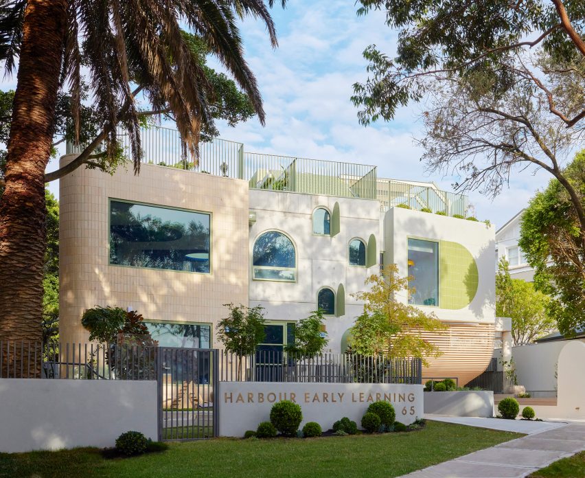
Danielle Brustman designs Harbour Early Learning facility
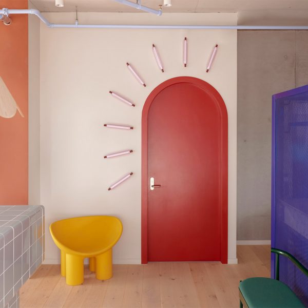
Bold colours and graphic elements that represent the sea and sky add personality and context to the interiors of this Sydney children’s centre by Australian designer Danielle Brustman.
Brustman was responsible for the interior package of the Harbour Early Learning educational facility, which is situated in the city’s Vaucluse suburb and aims to connect children with educators, nature and the broader community.
The brief for the project called for a high-quality facility arranged over three levels with a focus on design integrity and the well-being of both the children and staff.
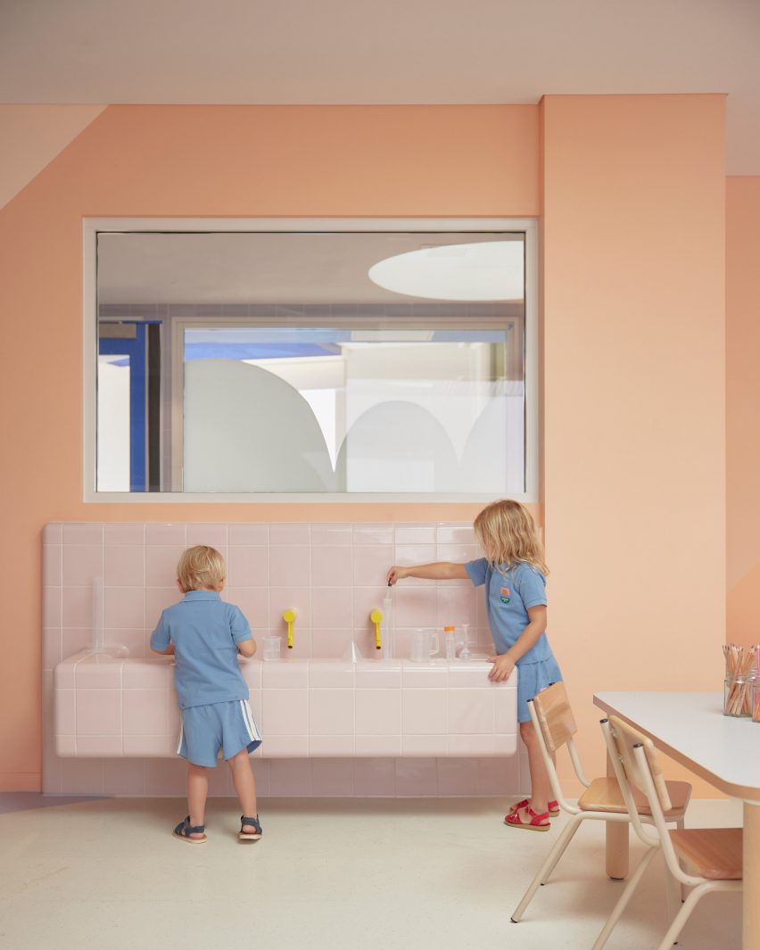
Brustman employed oversized graphic elements throughout the spaces to help stimulate the imaginations of the children and create thematic experiences that respond to the building’s harbourside setting.
“I wanted the design to inspire delight and joy for the people occupying the spaces,” the designer told Dezeen.
“I also wanted to create a healthy space using environmentally sustainable and quality materials that would stand the test of time and toddlers!”
Brustman worked closely with architects SJB and Supercontext, as well as with landscape designer Fiona Robbe and signage experts Citizen to deliver a range of bespoke indoor and outdoor play and learning spaces that reflect the client’s educational philosophy.
The building’s external and internal spaces were designed to reference the surrounding nature, with large openings framing views of the neighbouring mature fig trees.
The interior was heavily influenced by the building’s seaside context, with each room given a specific theme including the Sky room, Sunset room, Rainbow room, Under the Sea room and Boat room.
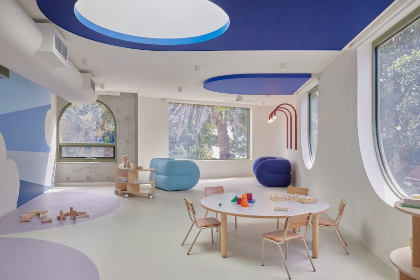
The themes lend the rooms a unique character whilst reinforcing the thoughtful layout of spaces, with water-based elements on the ground floor and sky references on the upper floor.
Graphic details were used throughout the interior to complement architectural features, including the arched windows and circular skylights.
Marmoleum flooring and carpet inlaid with geometric shapes also feature alongside bespoke murals depicting simplified elements like waves and clouds.
The raw materials and neutral tones used for the exterior give way to more vibrant hues inside the building.
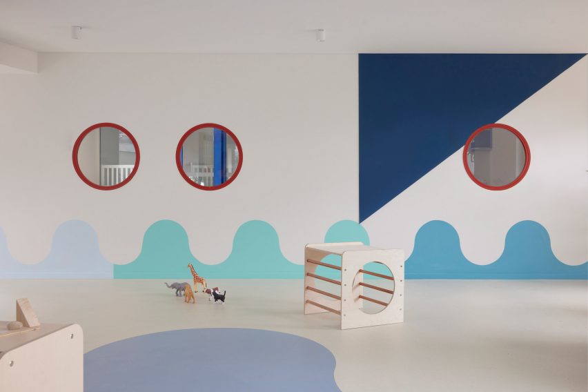
Brustman selected colours that she said have “a slightly muddied feel to them” to maintain consistency and a connection to nature.
“It was important that the colour and materials palette was unique in each room but there was also a cohesive thread throughout,” she added. “The palette was designed to be enjoyed by both children and teaching teams.”
Materials that appear on the building’s exterior, such as raw concrete and pale wood, recur in the reception area where they contrast with colourful elements that help with wayfinding and circulation.
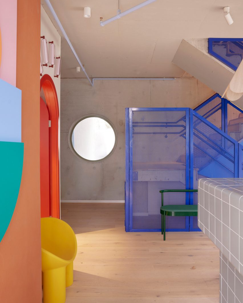
The primary hues in this space reference the work of Dutch abstract painter Piet Mondrian, while the blue staircase in particular evokes the colours of Sydney Harbour.
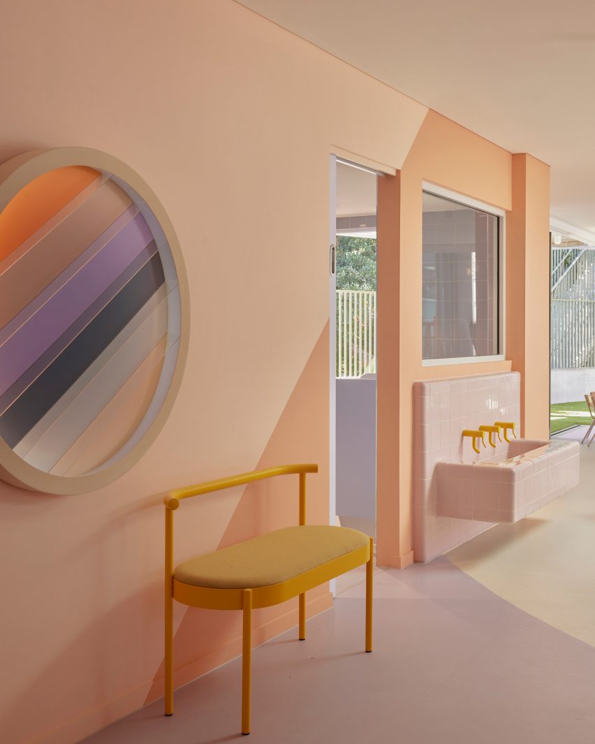
Wherever possible, Brustman chose furniture that was designed and made in Australia, focusing on pieces that are robust enough to handle being used by children.
Many of the furnishings have a graphic quality to them, including the Love benches by designer Daniel Emma, the stacked-cone pendant light by designer Edward Linacre and the Big Friendly sofa designed by CJ Anderson for Dowel Jones.
Brustman is based in Melbourne and specialises in residential interior design and commercial design for the education, hospitality and retail sectors.
The designer’s previous projects include a children’s centre in Melbourne featuring similar graphic elements in various pastel hues and a hair salon decorated using the client’s signature yellow colour.
The photography is courtesy of Harbour Early Learning.
link

