How dusky colors will redefine interiors in 2025

Home Improvement
Local designers weigh in on the paint industry’s Color of the Year picks and offer inspiration for your next remodel.
Over the past few years, interior design was in its “Folklore” era. In Taylor Swift terms, that means autumnal shades, with rust as its hero, were everywhere. Burnt umber, burgundy, olive green, and chocolate brown practically glistened. The vibe was earthy but uplifting, with these amped up ′70s-era accents enlivening white rooms.
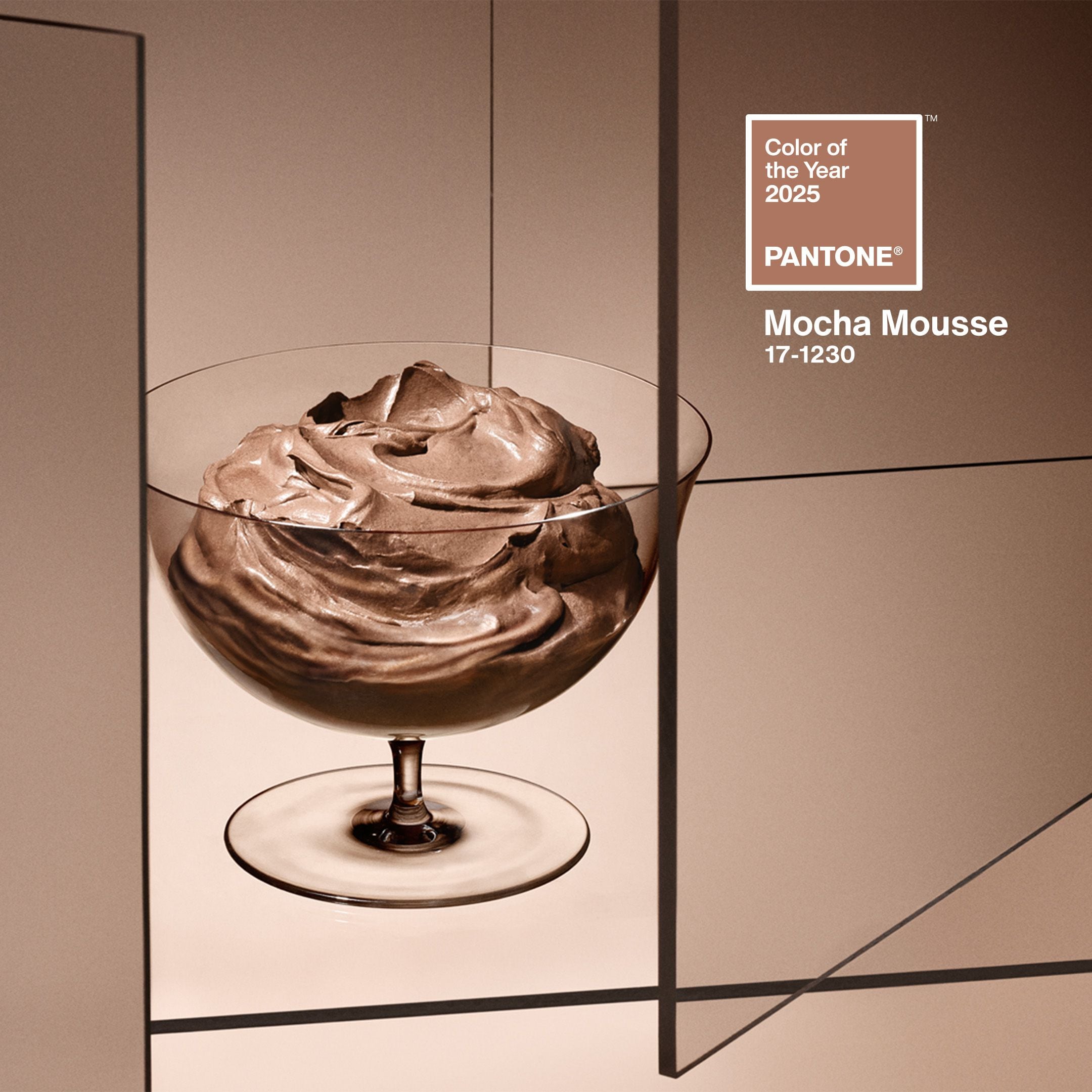
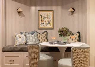
In the past year or so, the foliage-inspired palette turned to dust, and a dusky one emerged. Today, we’re seeing smokier shades. Retailers are offering products in colors called “Bone,” “Moss,” “Haze,” “Dusk,” “Fawn,” “Laurel Clay,” “Dune,” and “Fog.” The subdued (some say soothing) mood is mirrored in the newest “it” colors paint companies put out leading up to the Dec. 5 Color of the Year announcement from the Grand Poobah of color, Pantone. Pantone’s pick for 2025: “Mocha Mousse,” a “warming, brown hue imbued with richness. It nurtures us with its suggestion of the delectable qualities of chocolate and coffee, answering our desire for comfort.”
Color of the Year choices reflect global culture and anticipate our emotional needs, a sort of hued salve for our collective mood, if you will. Each color is a yellow (aqua, magenta, etc.) brick road toward a more peaceful, creative, energetic, grounded, luxurious, and so on future. A virtual color drenching of sorts.
In true marketing fashion, the companies try to cover it all. A color is bold and subdued, dramatic and tranquil; imperfect and secure. Still, in the messaging, a few stand out. Behr deems “Rumors,” a deep ruby red, “dynamic” and “energetic”; Glidden’s “Purple Basil” is meant to represent “the appreciation for self-discovery and self-expression”; Minwax also touts dynamism, energy, and self-expression in promoting “Violet.”
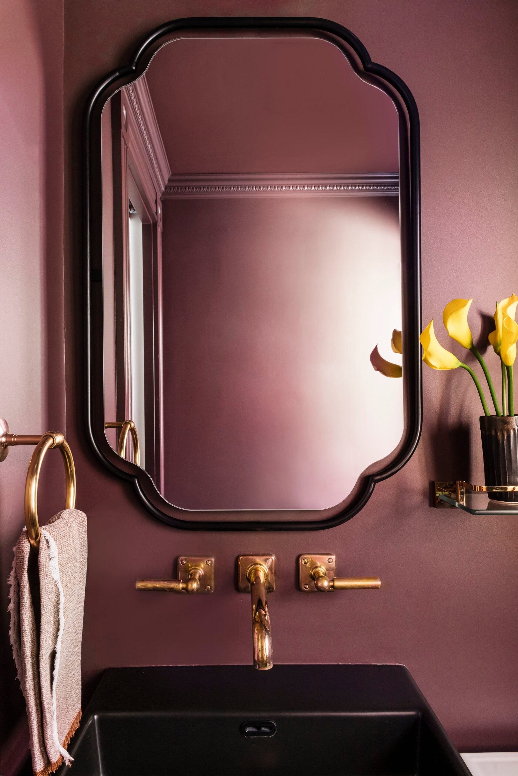
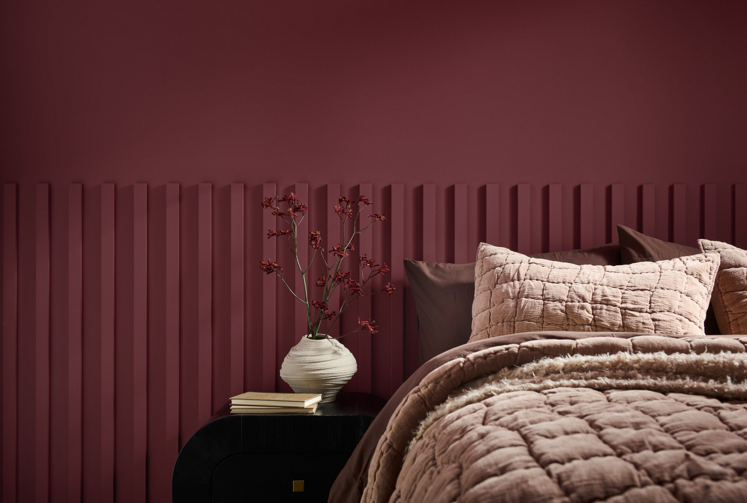
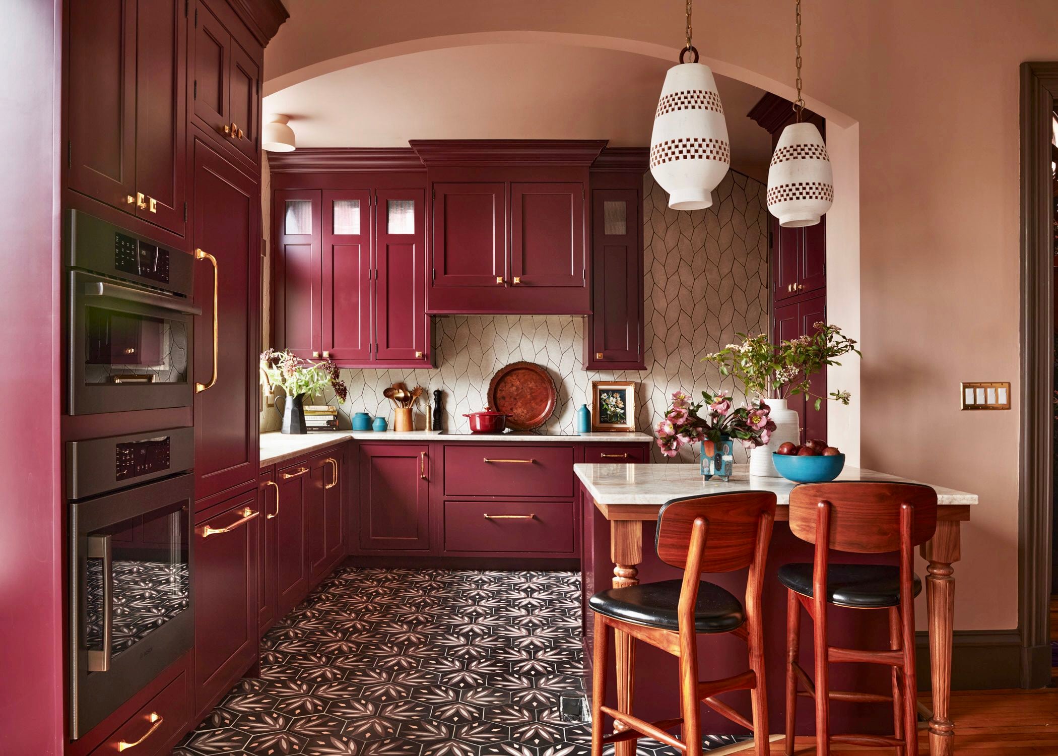
Many companies reference concepts surrounding comfort. Dunn-Edwards’s “Caramelized” is “cozy” and “inviting”; Graham & Brown’s “Elderton,” a soft brown, is “enveloping”; Stainmaster’s “Truffle” is “restorative.” Another popular descriptor is “grounding.” In its statement about “Raku,” a burnt brownish red, C2 writes, “In a world where polarizing views can divide and isolate, Raku . . . returns us to simple, grounding pleasures.” Perhaps we will all seek solace by staying in.
Interior designers don’t consider Color of the Year gospel; creatives pride themselves as being creative, after all. Plus, if everyone’s doing it, fatigue sets in faster. “We try not to be too on trend,” Jess Cooney, a Great Barrington-based designer said. “It can lead to a space feeling outdated too soon.”
That said, Vanessa Pierre of Randolph-based design studio Vannie Paradis finds trends useful in nudging clients to try something new. “Social media, which showcases various ways these trends are applied, encourage you to be bold enough to try them yourself.”
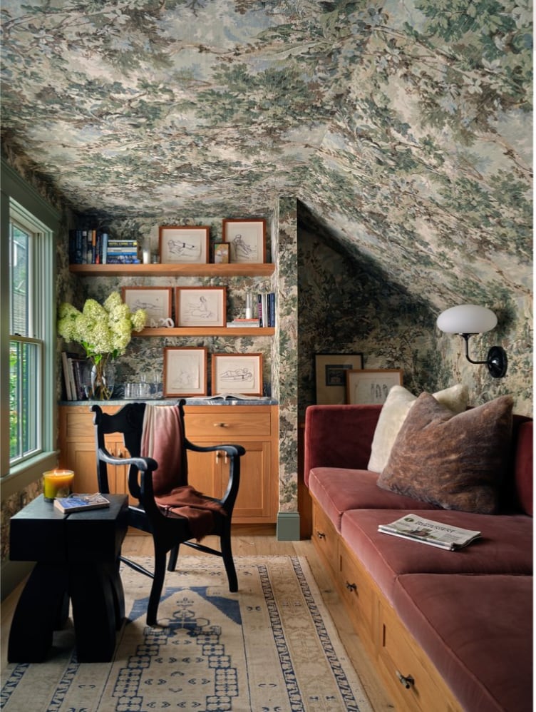
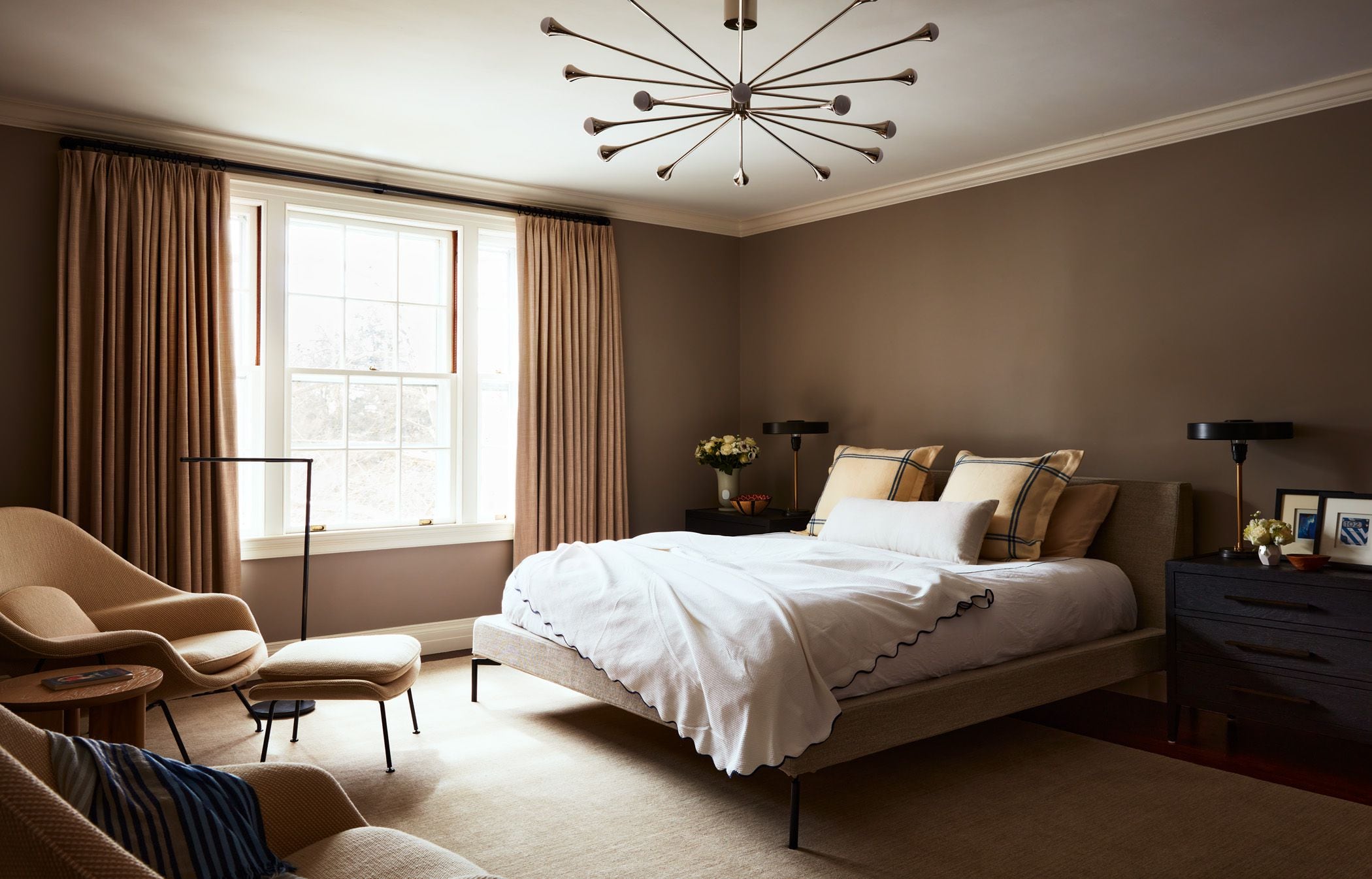
“This palette is a journey,” said architect Marilyn Moedinger, founding principal of Runcible Studios in Boston. “At first impression, it feels pretty ho-hum as a palette. It’s a little desaturated, a palette that’s ready to snuggle up for winter and a bit tired of living through These Unprecedented Times over and over. But, if we start imagining these colors as textured — a rich eggplant velvet, a warm and weathered dark chocolate leather, a sun-faded wall of classic New England shingles, the darker sandy shade of beaches in low winter light — things start to become more interesting: deep, moody, quietly bold.”
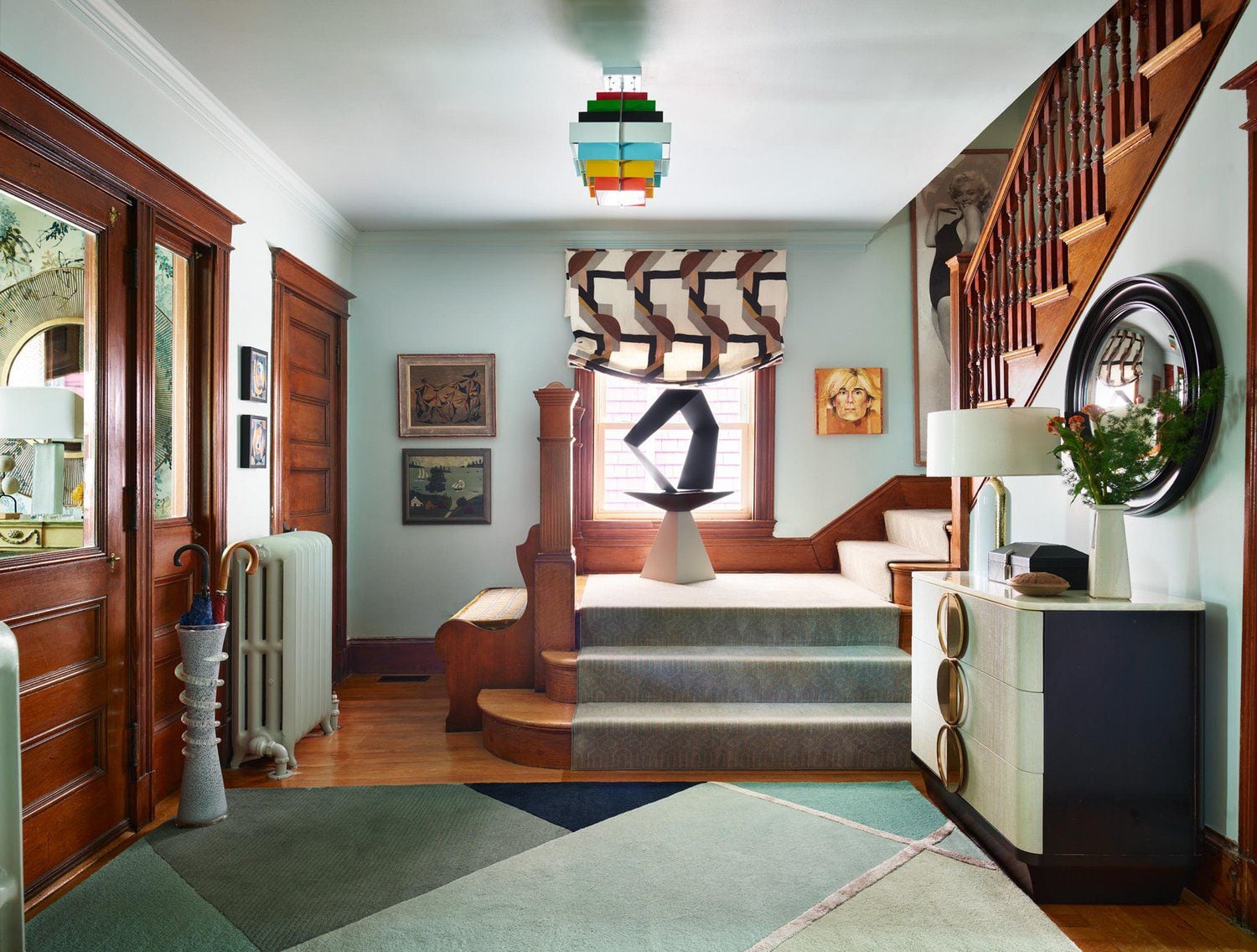
We asked more than a dozen New England designers for their impressions on the coming year’s standout shades. Several noted a historical essence. “The current color trend has a bit more of a muddy feeling and nods towards a different era,” Melrose-based designer Ana Donohue said. “It makes me think of a 1920s fashion palette.”
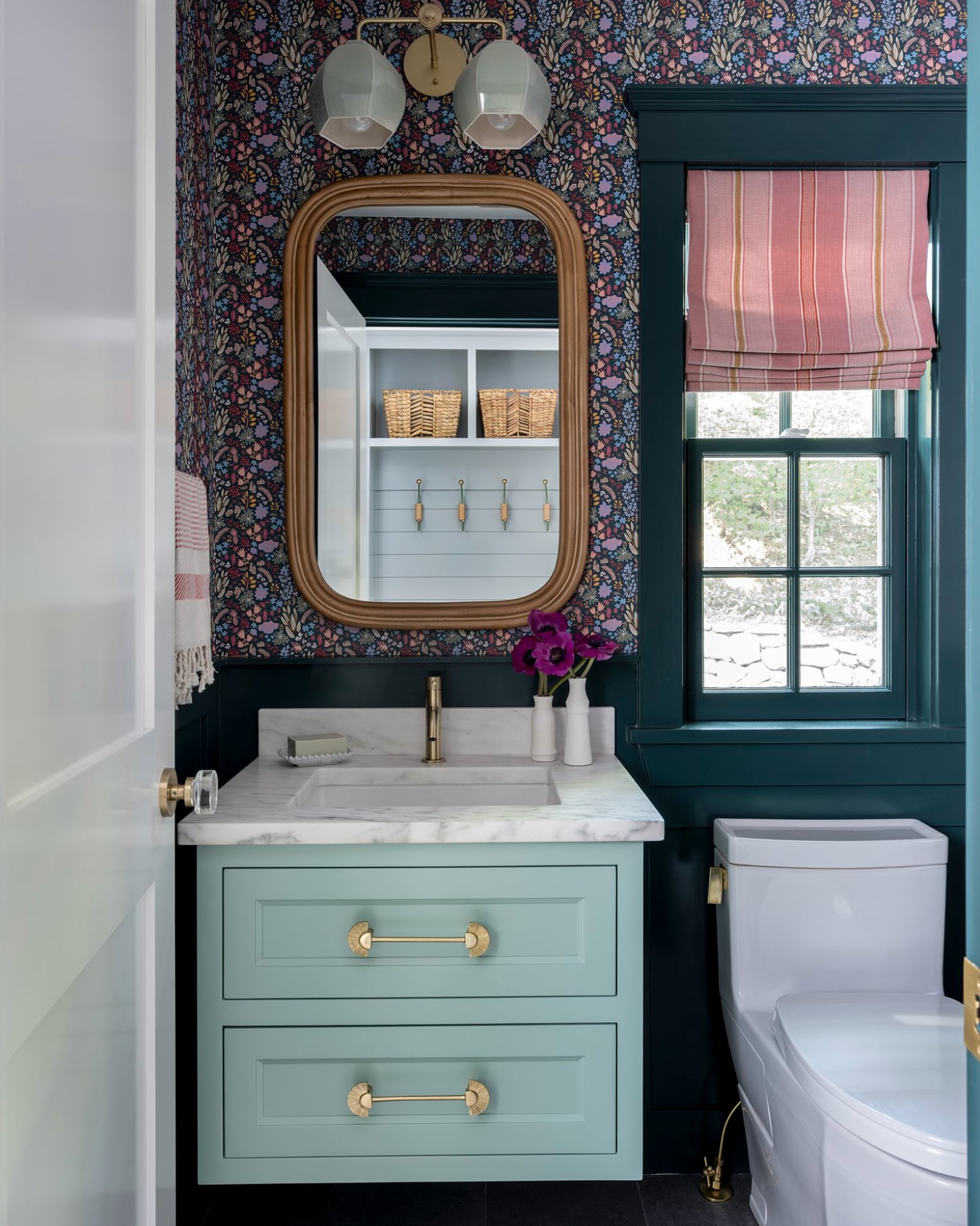
Cooney recently used some of these shades in a Victorian home. Waitsfield, Vt.-based designer Teri Maher finds them to be a blend of the Craftsman and Victorian periods. Sarah Scales is drawn to the colors’ sense of age. “The dusty, faded shades have a historic feel, as if they used to be jewel tones but have been softened and sun-bleached over time,” the Milton-based designer said.
For Meghan Shadrick of Arlington, parts of the palette are reminiscent of a more recent era: the early 1990s. Cooney concurs in regards to the decade’s predilection for sage green. “I’m not ready for that yet,” she said.
Still, overall, the impressions were positive. Area designers welcome the shift to warmer, moodier tones from the cool whites and grays that overtook interiors in the 2010s. “This palette hums with an earthy warmth and a comforting richness, a welcome departure from the coldness of gray,” Boston-based designer Dane Austin said.
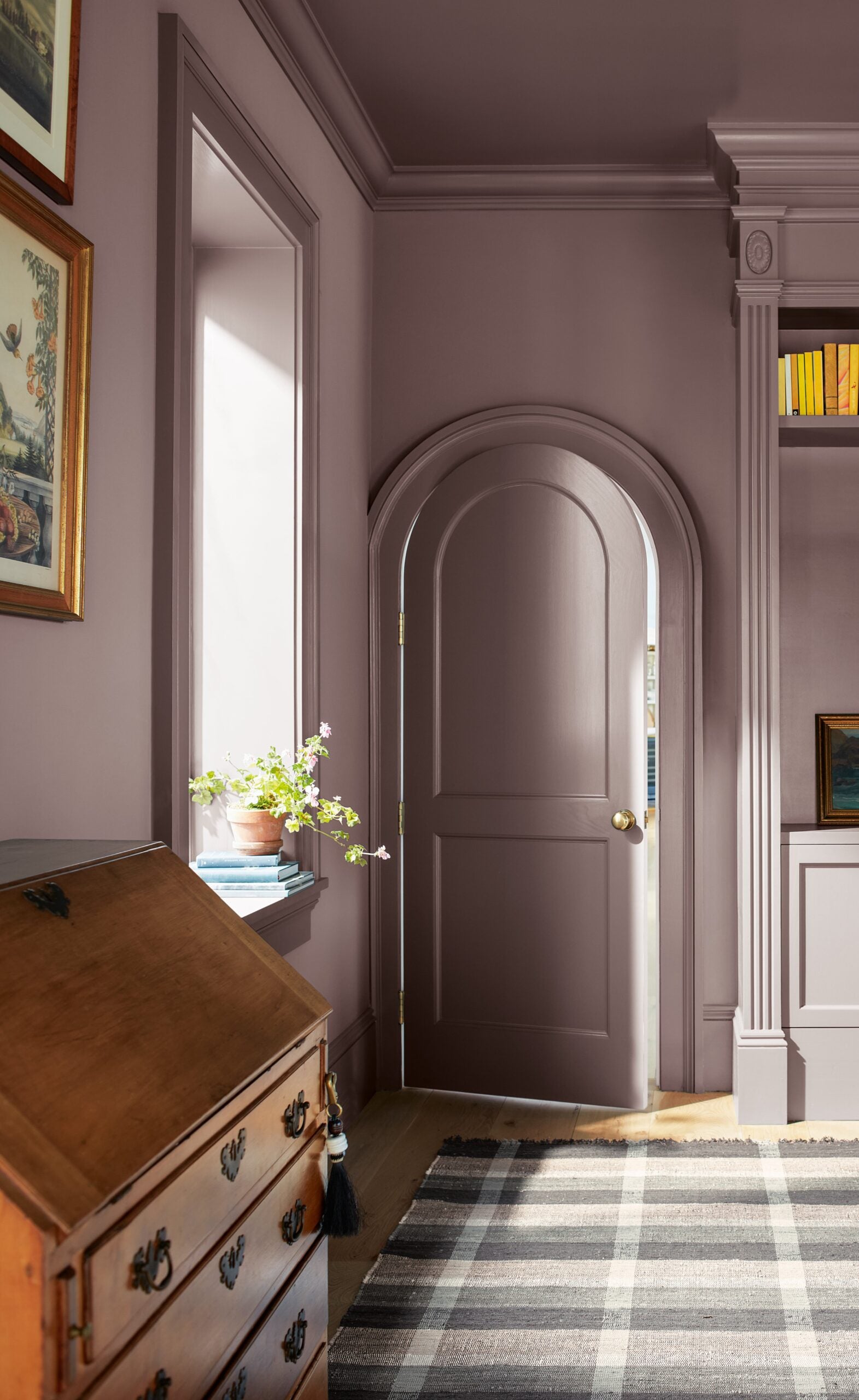
Designers appreciate that the colors are more nuanced, a point that Benjamin Moore put forth in promoting “Cinnamon Slate,” a heathered plum and velvety brown blend. Wellesley-based designer Lindsey Crowley gravitates toward ambiguous tones. “Living in the in-between world lends a level of sophistication, warmth, and mystery,” Crowley said. Brookline-based designer Stephanie Freeman also favors colors that are hard to describe, calling these the new neutrals.
There is a lot of enthusiasm for the dusky reds and purples. Local fans include Alina Wolhardt of Boston- and Los Angeles-based Wolf in Sheep Design, Taryn Bone of Somerville-based Bone Collective Studio, and Wellesley-based designer Lily Flatley.
Brown too, mostly.
“I am already a bit bored of the browns coming back so hard,” Cooney lamented.
It’ll be 2026 soon enough.
Marni Elyse Katz is a contributing editor to the Globe Magazine. Follow her on Instagram @StyleCarrot. Send comments to [email protected].
Address newsletter
Get the latest news on buying, selling, renting, home design, and more.
link